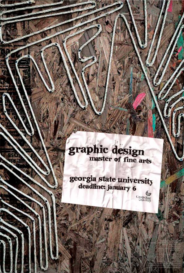
This poster advertises the Design M.F.A program at Georgia State University. I started the process with scrap particle board and rope and nailed the design down. Using tactile objects and lots of textures is one of my favorite parts of design.
Building a friction fire, correctly identifying a medicinal plant, or weaving your own basket for the first time give you a powerful connection to the millions who came before you with these same skills to survive, as well as the recognition that nature provides all things we need. Piedmont Earthskills Gathering teaches those skills, and I created this flyer and accompanying social media graphics to reach out to folks looking learn more about that way of life.
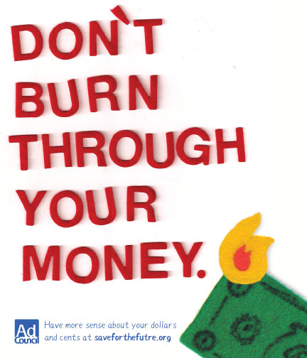
This ad campaign was fun to make. I found felt letters at the craft store and created the felt money and fire. The layout was created entirely on my scanner by laying the pieces out until it felt right. This campaign was aimed at a younger audience and this felt fun without being condescending.
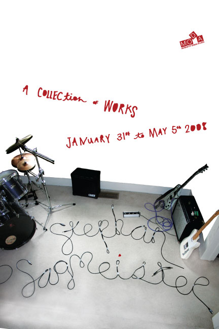
Stephan Sagmeister is well known for his innovative typography. This poster is an homage to that while also promoting a collection of his works at MODA.
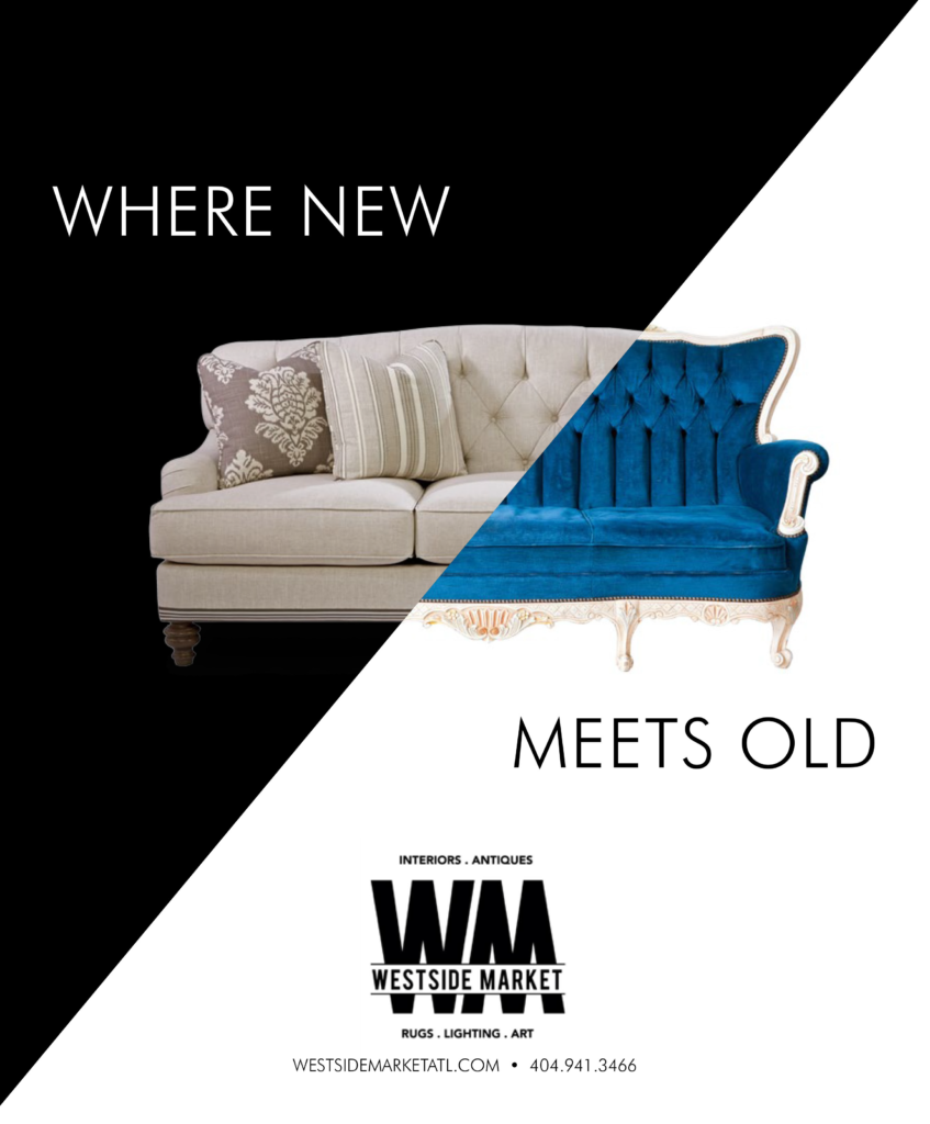
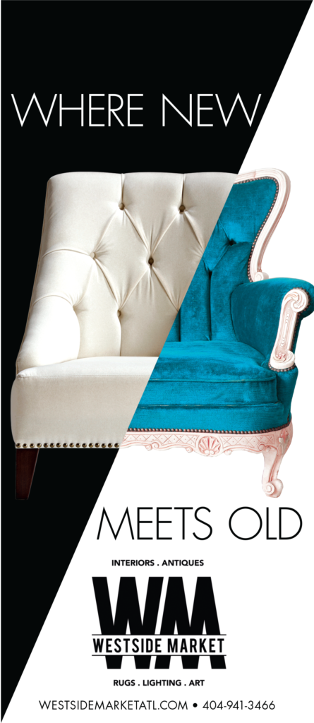
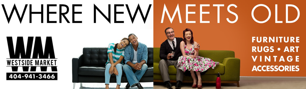
Westside Market has been a great client to work with. They have great taste and a good eye. Their store covers a wide range of furniture designs and they wanted to illustrate that succinctly as possible. “Where New Meets Old” started as a billboard campaign and broadened to magazines and web.